Case Study — Visual Identity & Brand System
ALIGN CARE — Where Clinical Clarity Met Human Warmth.
Trusted care does not need to feel cold.
- Client
- ALIGN CARE
- Industry
- Healthcare & Wellness
- Service
- Visual Identity & Brand System
- Project Type
- Care and Recovery Brand Identity
Overview
Matrix built a calm, structured visual system for a care and recovery brand—precise enough to inspire confidence and human enough to feel close.
Client Request
Build a modern identity for a care and recovery brand. The brief was to give ALIGN CARE a trustworthy medical presence without losing the calm and human character associated with health and wellness.
The Real Gap
The challenge was not to make the brand look medical. It was to create confidence without creating distance. Care brands are often caught between two incomplete expressions: an identity that feels precise but cold, or one that feels warm but lacks visible authority. ALIGN CARE needed to bring medical confidence and human consideration together within one presence.
Human Shift
Before
A brand that could appear medical yet distant—or approachable without feeling sufficiently specialised.
After
A modern, organised care brand that makes expertise visible without losing the warmth of the experience.
Governing Decision
Clinical Clarity. Human Warmth. Every element needed to communicate expertise without feeling severe, and create closeness without weakening trust. This decision guided the mark, colour, typography, imagery, and messaging, bringing them together within one calm and recognisable language.
Brand Story
The Brand Platform — Better care does not stop at treatment. It improves how life is lived. Move Better. Recover Smarter. Live Healthier. The platform connected movement, recovery, and everyday health, giving the brand room to operate across different services and experiences without losing its central meaning.
The System We Built
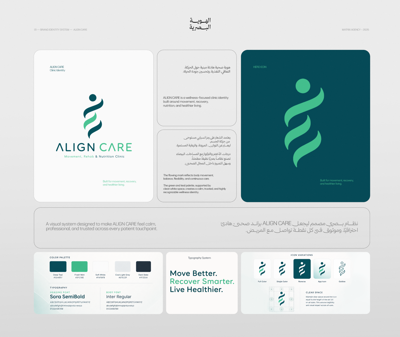
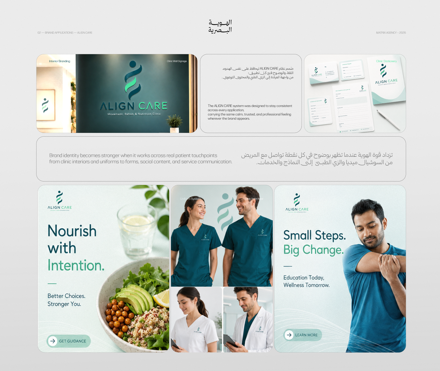
The Mark: a clean, wellness-oriented mark that gives the brand a distinctive presence without unnecessary visual complexity. The Colour: a teal palette connecting calmness with health while creating balanced differentiation within the care category. The Typography: a clear, disciplined editorial system designed for readability, organisation, and confidence. The Imagery: a direction combining specialist, care, and nutrition photography while presenting people within natural, considered health contexts. The Language: short, positive messages connecting care with everyday choices and gradual improvement. The Consistency: all elements work together to preserve the same character across uniforms, imagery, content, and campaigns.
Execution Proof
Execution Proof — Identity Foundation: the first presentation brings together the mark, colour palette, typography system, and verbal platform within one visual foundation. The Identity in Context: the second presentation extends the system into professional uniforms, specialist portraits, nutrition imagery, and health and recovery messaging. Together, both presentations demonstrate how the identity maintains the same balance of precision and warmth across different contexts.
Deliverables
- 01Logo and brand mark
- 02Colour palette
- 03Typography system
- 04Verbal brand platform
- 05Brand messaging
- 06Professional uniform application
- 07Specialist photography direction
- 08Nutrition photography direction
- 09Key campaign lines
- 10Identity applications in context
Outcome
Care became visible in the way it needed to be understood. ALIGN CARE gained a visual system that combines medical organisation with human calm and can move from the mark and uniforms to imagery, content, and campaigns without losing its meaning.
What We Learned
Trust is not always built through greater severity. In care categories, an identity becomes stronger when expertise is visible, the human presence remains clear, and the distance between them becomes shorter.