Case Study — Social Media Campaign
GYMNATION — One System for Six Different Messages
Content changes. The brand's character should not. Matrix designed a six-post campaign that brings classes, events, performance, coaching and seasonal promotions into one recognizable black-and-gold visual language.
- Client
- GYMNATION
- Industry
- Fitness & Gyms
- Service
- Graphic Design & Social Media Campaigns
- Project Type
- Six-Post Campaign Design System
Overview
Content changes. The brand's character should not. Matrix designed a six-post campaign that brings classes, events, performance, coaching and seasonal promotions into one recognizable black-and-gold visual language.
Client Request
Design a set of social media posts for different communication goals. The set needed to cover classes, events, performance, coaching and promotions without losing the brand's character.
The Real Gap
Every message needed to say something different without looking as though it came from a different brand. Designing each post in isolation would have fragmented the page and weakened the distinctive black-and-gold presence of GYMNATION.
Human Shift
Before
Multiple topics that could read as disconnected campaigns.
After
Different messages within one system—recognizable as GYMNATION before the audience even reads the name.
Governing Decision
A post may change its purpose—not its identity. We fixed the rules that define GYMNATION and allowed imagery and composition to change according to each post's function. The brand stayed consistent while the messages moved between awareness, engagement, performance and sales.
Brand Story
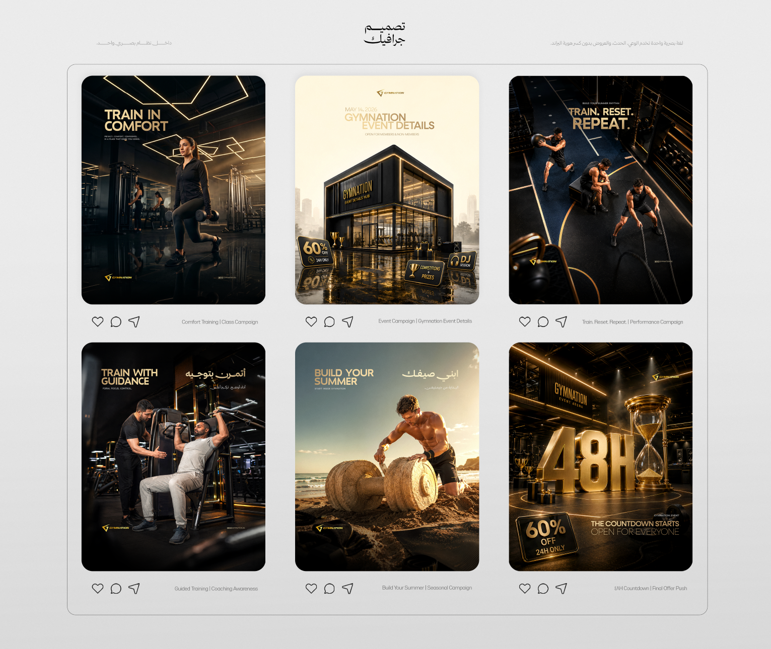
Content Architecture — 1) Train in Comfort: introducing the class experience and comfort within the gym. 2) GYMNATION Event Details: organizing event information into a clear hierarchy. 3) Train. Reset. Repeat.: connecting performance with continuity and return. 4) Guided Training: highlighting the role of coaching in the training experience. 5) Build Your Summer: a seasonal message about preparation and progress. 6) 48H Countdown: translating the same system into a direct promotional message.
The System We Built
Imagery: cinematic, low-light treatment that preserves the depth of black and the presence of athletes and space. Colour: black as the primary field, with gold as the brand signal and focal accent. Typography: clear gold headlines with a hierarchy that gives every message the right visual weight. Composition: controlled spacing, a consistent logo position and rules that prevent clutter. Language: a bilingual headline system that accommodates Arabic and English without breaking the visual rhythm.
Execution Proof
The posts were not identical. They belonged to the same language. Images, headlines and functions changed, while colour, composition, typography and logo placement remained consistent enough to preserve GYMNATION's identity.
Deliverables
- 01Unified campaign design system
- 02Six social media posts
- 03Black-and-gold image treatment
- 04Headline hierarchy
- 05Bilingual headline system
- 06Consistent logo-placement rules
- 07Awareness, performance, event and promotional applications
Outcome
Each post served a different function. The brand perception stayed consistent. The campaign became a connected system that could move across distinct messages without losing GYMNATION's premium character or recognizable visual language.
What We Learned
Consistency does not mean every piece should look the same. It means the message can change freely while the rules that make the brand recognizable remain intact.