Case Study — Visual Identity & Brand System
ONYX GYM — When Speed Became a Visual Language.
Performance should not only be stated. It should be seen.
- Client
- ONYX GYM
- Industry
- Fitness & Performance Training
- Service
- Visual Identity & Brand System
- Project Type
- Performance Club Identity & Launch System
Overview
Matrix built a visual system for a performance club that translates speed, discipline, and energy into a recognisable presence across the mark, colour, typography, imagery, and every brand application.
Client Request
Build a strong identity for a new performance club. The brief called for a presence that would immediately feel fast, sharp, and energetic, with enough structure to lead the launch and extend across campaigns, apparel, and the physical space.
The Real Gap
Athletic language alone does not make a brand feel athletic. Many fitness brands rely on the same dark imagery and high-energy claims. When the energy exists only in the headline, one brand becomes difficult to distinguish from another. ONYX GYM needed movement to become part of the identity’s construction—not another promise placed over the design.
Human Shift
Before
A new performance club with clear energy but no established presence audiences could recognise.
After
An athletic brand that feels fast and disciplined even in static applications and preserves the same character from the mark to the physical space.
Governing Decision
The brand must look in motion, even when nothing is moving. This decision guided the mark, contrast, typography, angles, image treatment, and launch messaging. Speed became more than the campaign subject. It became the rule governing the entire visual system.
Brand Story
The Brand Platform — Movement is not what follows preparation. It is how performance begins. MOVE FAST. A direct platform giving the brand its pace while supporting messages around speed, focus, discipline, and power without losing the central idea.
The System We Built
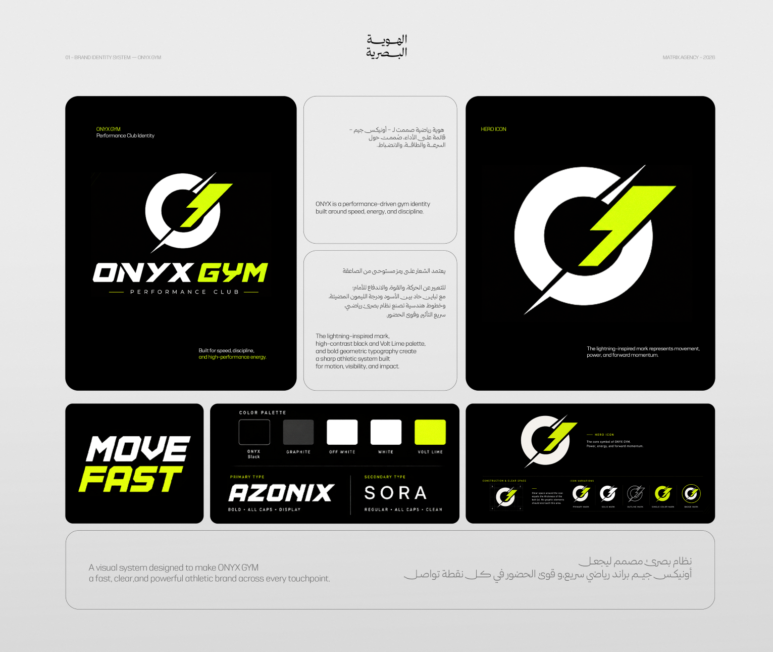
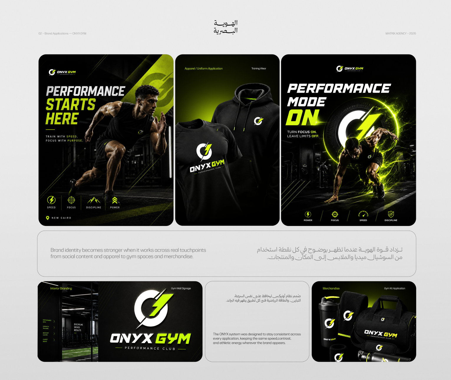
The Mark: a lightning-inspired symbol cutting through a circular form to express movement, power, and forward momentum within one recognisable icon. The Colour: a foundation of deep black and controlled neutrals interrupted by electric Volt Lime to create contrast, visibility, and energy. The Typography: Azonix leads with a sharp athletic display style, while Sora provides clarity and discipline across supporting copy and functional applications. The Imagery: athlete-led art direction combining forward movement, high contrast, and electric treatments that make energy part of the composition. The Language: short, decisive headlines connecting performance with action, focus, and discipline across launch communication. The Applications: the system extended into campaign content, training apparel, interior signage, merchandise, and gym equipment while preserving one consistent character.
Execution Proof
Execution Proof — Identity Foundation: the first presentation brings together the logo, hero icon, colour palette, typography system, MOVE FAST platform, and core mark-usage rules. The Brand Across Touchpoints: the second presentation moves the system into athlete campaigns, training wear, gym-wall signage, merchandise, and gym-kit applications. Together, both presentations demonstrate how speed moved from an idea into a system that retains its identity across real touchpoints.
Deliverables
- 01Logo and hero mark
- 02Colour palette
- 03Typography system
- 04Brand platform
- 05Mark usage and clear-space rules
- 06Visual language and image treatment
- 07Launch campaign messaging
- 08Athlete-led campaign designs
- 09Training apparel applications
- 10Interior branding and signage
- 11Merchandise and gym-kit applications
Outcome
Performance became visible before the workout began. ONYX GYM gained a connected visual system that makes speed, discipline, and energy recognisable across the mark, campaigns, apparel, and space without relying on a separate message to explain the brand.
What We Learned
Motion does not always require video. When an identity is built around a clear decision, its mark, typography, colour, and composition can make the brand feel in motion—even within a static frame.