Case Study — Brand Building & Visual Identity
OPI GYM — From a New Name to a System Built to Scale
The client came to Matrix with the name OPI GYM and a vision for a new fitness destination. We built everything behind that name: the brand story, strategic direction, logo, visual identity, verbal language and applications—turning it into a coherent system designed to work from launch and scale without losing its character.
- Client
- OPI GYM
- Industry
- Fitness & Gyms
- Service
- Brand Building & Visual Identity
- Project Type
- New Brand Creation
Overview
Matrix scope: all brand-building and visual-identity work, except naming. The goal was to give OPI GYM a story, a personality and a visual system that could support its launch and continue to scale with the brand.
Client Request
Build a complete identity for a new gym. The request was to give OPI GYM a story, a personality and a visual system that could support its launch and continue to scale with the brand.
The Real Gap
A name identifies the brand. It does not give it meaning. The challenge was not to create an attractive logo. It was to build a central idea capable of connecting the space, apparel, products and content within one presence people could recognize and remember.
Human Shift
Before
A new name with no established meaning or personality in the audience's mind.
After
A clear fitness brand built around strength, discipline and progress—consistent across every touchpoint.
Governing Decision
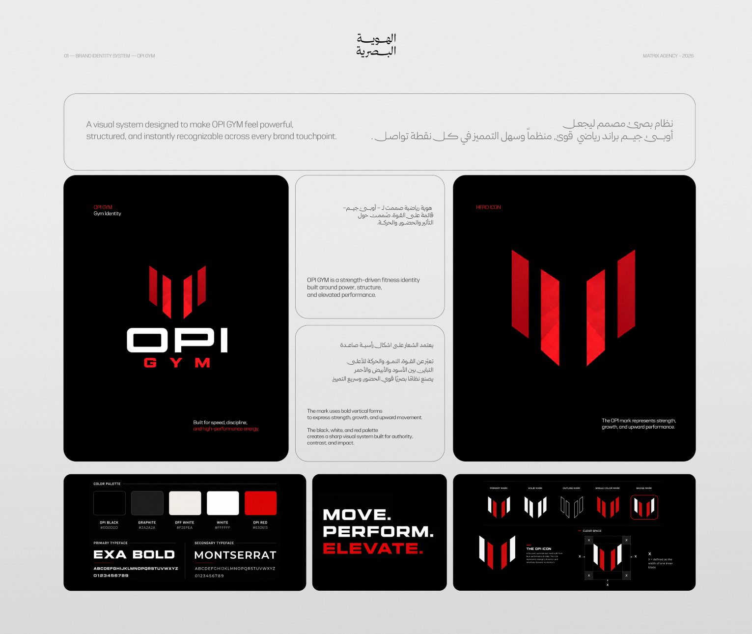
Rising Strength. The current level is not the finish line. OPI GYM was built around disciplined performance that moves people toward a stronger version of themselves. Every element—from the shape of the mark to the tone of the messages—had to carry a sense of movement and ascent.
Brand Story
Strength is not a destination. It is continuous upward movement. We positioned OPI GYM as an environment that pushes people beyond their current level. The story was built around four connected ideas: movement, discipline, performance and progress.
The System We Built
The idea of ascent did not remain a concept. It became a design rule. Form: rising vertical shapes give the mark a sense of movement and progress. Color: black and white establish strength and clarity, while red acts as the system's most distinctive signal. Typography: Exa Bold and Montserrat create a clear, direct, performance-driven voice. Language: short, decisive messages that express movement, performance and progress — “Move. Perform. Elevate.” These rules keep the identity recognizable from the primary logo to its smallest application.
Execution Proof
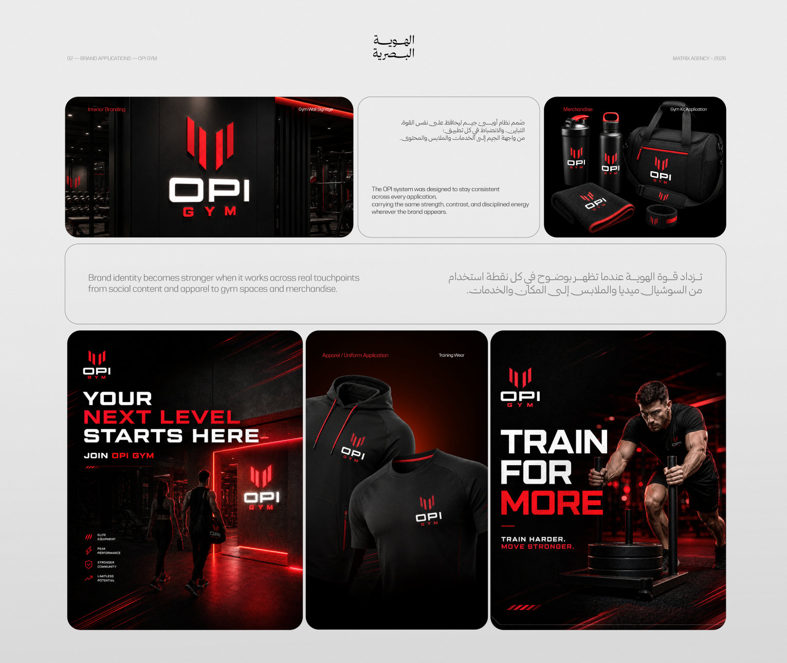
An identity is not proven inside a presentation. It is proven when it works in the real world. The system extended across signage and interior spaces, training apparel, gym equipment and merchandise, social media content, campaign messages and marketing materials. The identity did not remain a visual proposal; it was approved and applied across real brand touchpoints.
Deliverables
- 01Brand story and direction
- 02Logo and symbol design
- 03Visual identity system
- 04Color and typography system
- 05Brand language and messaging
- 06Campaign messages
- 07In-space identity direction
- 08Apparel and merchandise applications
- 09Social media applications
- 10Marketing materials
- 11Brand consistency rules
Outcome
OPI GYM was no longer a name waiting to be known. It became a complete brand carrying one meaning across the space, apparel, products and content—with clear rules that allow it to scale without losing its personality.
What We Learned
Scale does not begin by adding more assets. It begins with one governing decision and a set of rules that make every new application a natural extension of the same story.